± Site Related - Layout Information ±
- l a y o u t -
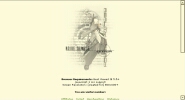
Site Version :: N.S Version 5.0 - Nadir
Version Name & Explanation :: Nadir - The point of the celestrial sphere that is directly opposite the zenith and vertically downward from the observer. Why? Because I like using obscure words in layouts; it appeals to me :) Everyone's heard of 'zenith'; not so its opposite.
Designed For :: IE 5.5+ | 800x600+ resolution | javascript and CSS enabled
Launched :: 4 April 2004
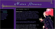
Scheme :: White. We wanted white for once, but it didn't really turn out that way. So, it's more white and grey, with other miscellaneous colours thrown in for interest.
We wanted to cut down on the number of images used - 'simple and sweet' was the running anthem for the layout, so there's really only the one large-ish image at the top. The problem is, I like designing image heavy sites... This feels like a backward step.
Created With :: All code done in Notepad and CuteHTML - none of that WYSIWYG nonsense ;) All graphics were done with Photoshop 5.5 (still must-get-6...! or 7, even better), image mapped by hand with Paint, and checked with Irfan View. Get Irfan View! It's the best and it's free.
Fonts Used :: Title font is 'Felix Tiling', and the menu font is 'Silkscreen'.
Notable Points :: We have our own dot.com :D
We had to move the site because regrettably, Black-Waltz.Net was closing down. The final impetus I suppose for moving Noire Sensus to its own domain name and server. So, here we are :) I've also attempted to make the entire site XHTML 1.0 and HTML 4.01 compliant; I like working to a standard, it makes site decisions vastly easier. The idea is the more it adheres to the standards, the better its viewability across browsers.
- o l d l a y o u t s -
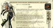
Site Version :: N.S Version 4.0 - Reality Breach
Designed For :: IE 800x600+ resolution | script and css enabled
Launched :: 10 August 2002
Host :: Black-Waltz.Net
Scheme :: Ah, yellows, browns and yellow-greens, I guess. I'm not sure exactly what we were going for here - something techno-ish, but still mildly fantasy, too. It wasn't exactly hard to make, just time consuming (my entire weekend), since I had a pretty good idea of what I wanted.
Anyway, it was all Calintz's fault - he was perfect to use as a theme, and then I saw the rest of Softmax's character designs... ::happy sigh:: They all work so well as site designs - high quality, high resolution and detail, interesting designs, you name it, so here ya go. I still have no idea what the storylines are, though, because I can't read or speak Korean.
Created With :: Notepad and CuteHTML. All graphics were done with Photoshop 5.5 (must-get-6...! or 7, even better), cut up with Paint, and converted with Irfan View. Get Irfan View! It's the best and it's free.
Fonts Used :: Well, I went out on a font hunt the other day, so they're all new fonts to my computer. The text links along the top are all 'Alien League' - from the Aliens movies. I'm not sure what the affiliate font was - probably 'Xenotron' or 'Vibrocentric' - I like techno fonts ^-^ Reality Breach title font along the bottom is 'Seraphim', and the link to the top of the page and copyright notice are both '911 Porsha'.
Notable Points :: It worked! That's all I care about - and I still can't do swirly things with Photoshop :( ...I actually did the 'affiliate' thing right this time... Oh! And we've finally abandoned frames. Noire Sensus is now 100% frames-free. Very happy about that ^_^
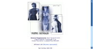
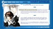
Site Version :: N.S Version 3.0 - In Blue
Designed For :: IE 800x600 resolution | frames, script and css compatible
Launched :: 14 November 2001
Host :: Black-Waltz.Net
Scheme :: Blues -- we were trying for an ice effect, but gave up. Also completely backed away from black colour schemes for the first time. ::blink + squint:: It's so bright in here...
Created With :: Notepad and CuteHTML -- I'd die without CuteHTML >_< All graphics were done with Photoshop, cut up with Paint, and converted with Irfan View. Get Irfan View! It's the best and it's free.
Fonts Used :: The NS title/header font is Stonecross (just remember: it's a caps font). The image-person's font is Shelley Allegro, and Verdana is used everywhere else. Unfortunately, I can't tell you where to find them; they've been on my harddrive too long.
Notable Points :: First try on a new server, with a new host. Moved from Angelfire who, though serving us well for our stay with them, had way too many adds that screwed up our programming. Hence the scramble for a new host.
Site Version :: N.S Version 2.0 - Pretty Purple
Launched :: 12 June 2001
Site Version :: N.S Version 1.0 - The Beginning
Launched :: 16 February 2001 - Initially on Crosswinds, and then moved to Angelfire.
« back
|

